Choosing the right paint colours and techniques can completely transform your home, but with endless options it’s easy to feel overwhelmed. Whether you’re refreshing a single room or planning a whole-house makeover, the best interior design painting ideas combine colour psychology, architectural style, and practical considerations to create spaces that feel both beautiful and liveable.
What’s in this guide
- Understanding colour psychology in interior design painting ideas
- Trending paint palettes for Australian homes
- Room-by-room interior design painting ideas
- Advanced painting techniques and finishes
- Common mistakes to avoid
- FAQ
Understanding colour psychology in interior design painting ideas
The colours you choose for your walls do more than just look pretty—they actively influence mood, perceived room size, and even energy levels. Warm tones like terracotta, ochre, and soft peach create inviting, cosy atmospheres perfect for living rooms and bedrooms. These earthy shades work particularly well in Australian homes with natural light, complementing timber flooring and rattan furniture.
Cool colours such as sage green, dusty blue, and soft grey promote calmness and concentration, making them ideal for home offices, bathrooms, and bedrooms. According to research by Choice Australia, lighter cool tones can make small rooms feel up to 20% larger by reflecting more natural light—a crucial consideration in compact Australian apartments and townhouses.
Neutral palettes remain the foundation of versatile interior design painting ideas. Warm whites, greige (grey-beige blends), and taupe provide a sophisticated backdrop that allows you to change soft furnishings and artwork without repainting. These shades also photograph well, which matters if you’re planning to sell or rent your property in the future.
Trending paint palettes for Australian homes
In 2026, Australian homeowners are gravitating toward nature-inspired colour schemes that reflect our unique landscape. Dusty eucalyptus greens paired with sandy beiges create a quintessentially Australian aesthetic that works beautifully in both contemporary and traditional homes. This palette honours our natural environment while providing a calming, organic feel.
The coastal palette continues to dominate, particularly in Queensland and coastal New South Wales properties. Think weathered driftwood greys, soft ocean blues, and crisp whites with warm undertones. This scheme suits Queenslander homes beautifully, complementing traditional VJ (vertical joint) walls and wide verandahs. If you’re working with painted brick interior walls, these lighter shades can soften the texture while maintaining architectural character.
Darker, moody interiors are gaining traction in Melbourne and Sydney, with deep charcoal, forest green, and navy creating dramatic, sophisticated spaces. These bold interior design painting ideas work best in rooms with excellent natural light or when balanced with lighter ceilings and trim. Pair deep walls with brass or gold fixtures for a luxe, contemporary feel.
Terracotta and clay tones have made a strong comeback, particularly in mid-century modern and Mediterranean-style homes. These warm, earthy shades pair beautifully with natural materials like timber, stone, and linen. You’ll find guidance on coordinating interior and exterior schemes in our house painting exterior colours guide, ensuring your colour flow makes sense from kerb to kitchen.
Room-by-room interior design painting ideas
Living rooms and open-plan spaces
Open-plan living areas benefit from a cohesive colour story that defines different zones without hard divisions. Consider painting your main living wall in a feature colour—perhaps a soft sage or warm terracotta—while keeping adjacent walls in a complementary neutral. This technique creates visual interest without overwhelming the space.
For homes with high ceilings, don’t neglect the “fifth wall.” Painting ceilings in a soft colour—one shade lighter than your walls—adds depth and intimacy to large rooms. Alternatively, a crisp white ceiling reflects more light and makes spaces feel airier, which suits Australian climates where brightness is often abundant.
Bedrooms and private retreats
Bedrooms offer the perfect opportunity to experiment with calming, enveloping colours. Deep blues, soft lavenders, and muted greens promote restful sleep according to colour psychology research. In master bedrooms, consider painting one wall (typically behind the bed) in a richer tone while keeping others lighter to maintain a sense of space.
Children’s rooms allow for more playful interior design painting ideas. Rather than bright primary colours that can overstimulate, opt for softer versions—dusty pink, powder blue, or mint green. These shades grow with children and are easier to transition as their tastes mature. Chalkboard paint on one wall or section creates an interactive element without permanent commitment.
Kitchens and dining areas
Kitchen colour choices often depend on cabinetry. With white or light timber cabinets, you have freedom to introduce colour on walls—soft greens, warm greys, or even muted yellows can energise cooking spaces. For darker cabinetry, lighter wall colours prevent the room from feeling closed in.
The Building Code of Australia doesn’t mandate specific paint types for kitchens, but the Australian Building Codes Board does provide guidelines on ventilation and moisture management that affect paint performance. Choose washable, semi-gloss or satin finishes in kitchens to withstand splashes and frequent cleaning.
Bathrooms and wet areas
Bathroom interior design painting ideas must balance aesthetics with practicality. Light, reflective colours maximise the sense of space in typically smaller rooms, while darker shades can create a spa-like atmosphere in larger ensuites. Always use moisture-resistant paints formulated for wet areas—standard wall paints will peel and mildew in humid Australian bathrooms.
Consider the existing tile colours when selecting paint. If you have dated coloured tiles you’re not ready to replace, painting walls in a complementary neutral can minimise their visual impact. Soft greys work well with almost any tile colour, providing a fresh backdrop until you’re ready for a full renovation.
Advanced painting techniques and finishes
Beyond solid colours, several techniques add texture and depth to your interior design painting ideas. Colour blocking—using painter’s tape to create geometric sections in different colours—brings a contemporary, artistic feel to feature walls. This works particularly well in children’s rooms, home offices, and modern living spaces.
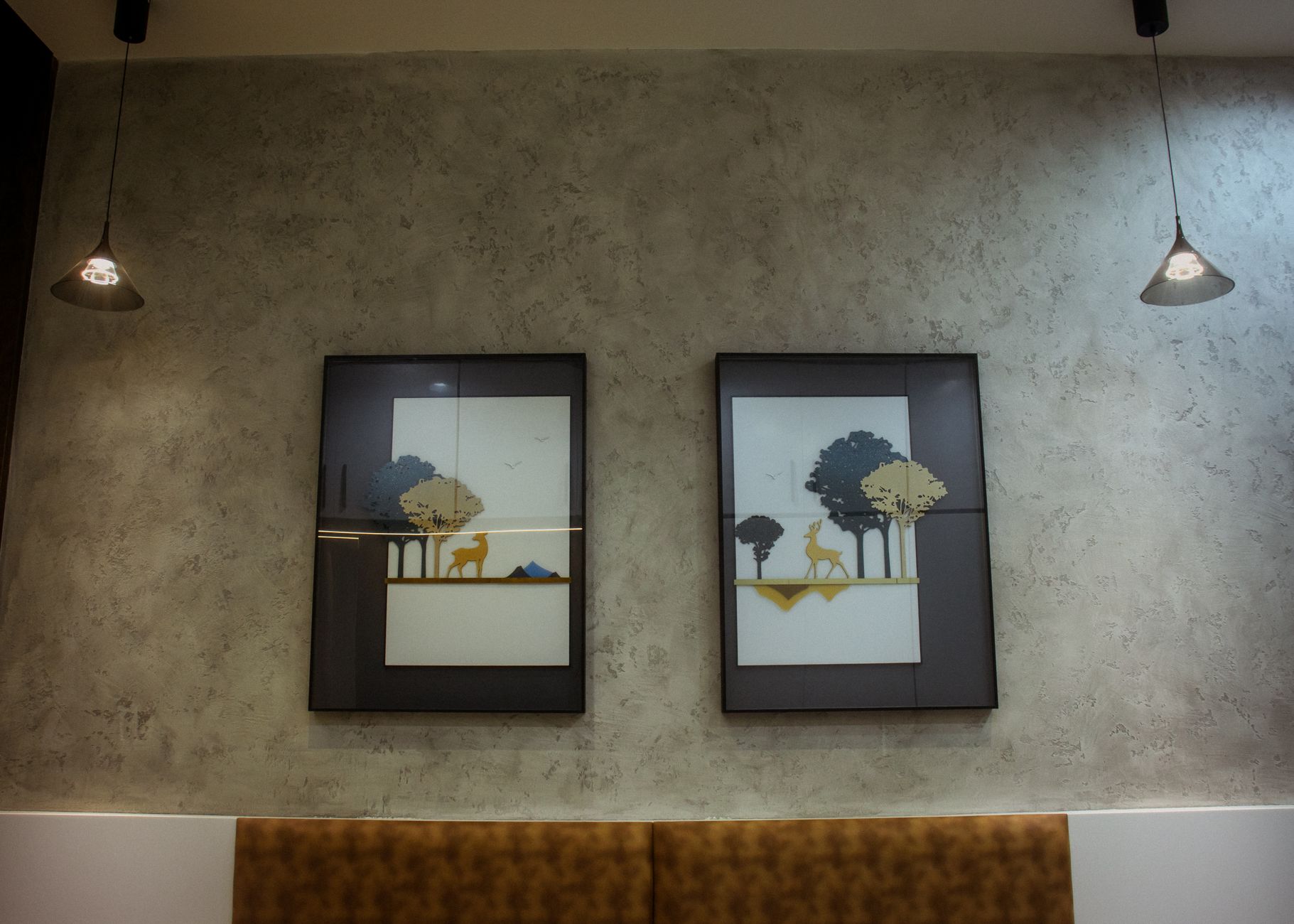
Limewash and chalk paint finishes deliver a soft, matte appearance with subtle variation that suits heritage homes and coastal properties. These breathable paints work beautifully on brick, plaster, and previously painted walls, creating an organic, lived-in aesthetic. The matte finish does require more careful cleaning than conventional paints.
Ombré and gradient effects create visual interest from floor to ceiling, typically transitioning from darker at the skirting to lighter near the ceiling. This technique requires more skill and patience but delivers a unique, custom look. Consider hiring a professional painter if you’re attempting this in prominent rooms.
Metallic and pearlescent finishes add glamour to feature walls, particularly in dining rooms and bedrooms. Use these sparingly—typically on one accent wall—as too much shimmer can overwhelm a space. These specialty paints also highlight wall imperfections, so thorough preparation is essential.
Coordinating with architectural features
Australian homes often feature beautiful architectural details—ceiling roses, picture rails, cornices, and timber panelling—that deserve thoughtful paint treatment. Painting trim and mouldings in a contrasting colour (typically white or cream against coloured walls) highlights these features and adds visual interest.
For heritage homes with period details, consider traditional colour schemes that honour the home’s era. The Victorian palette included deep reds, greens, and golds, while Federation homes often featured softer creams, greens, and terracottas. Modern interpretations of these schemes can bridge historical authenticity with contemporary comfort.
Common mistakes to avoid
One of the most common interior design painting ideas mistakes is choosing colours without testing them first. Paint colours look dramatically different depending on natural light, artificial lighting, and surrounding furnishings. Always purchase sample pots and paint large swatches (at least A3 size) on multiple walls, observing them at different times of day for at least three days before committing.
Ignoring undertones causes colour clashes that feel “off” even if you can’t immediately identify why. Most whites contain yellow, pink, blue, or grey undertones that interact with your flooring, furniture, and light. Hold paint samples against your existing elements to check compatibility, and remember that north-facing rooms in Australia receive warm, yellow light while south-facing rooms get cooler, bluer light.
Skipping proper preparation delivers disappointing results regardless of how premium your paint is. Walls must be clean, dry, and smooth—fill holes, sand rough patches, and use appropriate primers. This is particularly important when working with interior painting colour changes from dark to light or when painting over bold colours.
Using the wrong paint finish for the room’s function is another frequent error. High-traffic areas like hallways, children’s rooms, and kitchens need washable satin or semi-gloss finishes. Bedrooms and living rooms suit low-sheen or matte finishes that hide minor wall imperfections. Ceilings almost always look best in flat/matte white, which doesn’t reflect light harshly.
Painting rooms in isolation without considering flow between spaces creates a disjointed feel. Your interior design painting ideas should create a cohesive journey through your home. This doesn’t mean every room must be the same colour, but there should be a connecting thread—perhaps all neutrals share the same undertone, or accent colours relate to each other on the colour wheel.
FAQ
What are the most popular interior design painting ideas in Australia for 2026?
Nature-inspired palettes dominate, including eucalyptus greens, sandy beiges, and coastal blues. Warm neutrals like greige remain popular, while bolder homeowners are embracing deep charcoal, forest green, and terracotta for accent walls. The trend is toward calming, organic colours that reflect our landscape.
How much does it cost to paint interior rooms in Australia?
Professional interior painting typically costs $30–$60 per square metre depending on your location, wall condition, and finish complexity. A standard 4×4 metre bedroom might cost $800–$1,500 including labour and materials. DIY painting can reduce costs by 60–70%, though results depend heavily on skill and preparation.
Should I paint walls or ceilings first?
Always paint ceilings first, then walls, and finally trim. This allows you to cut in cleanly at each stage without worrying about splattering freshly painted surfaces below. Use painter’s tape at edges for crisp lines, and remove it while paint is still slightly tacky to prevent peeling.
What’s the best paint finish for different rooms?
Flat or matte works well in low-traffic areas like formal living rooms and adult bedrooms. Low-sheen suits most living spaces, offering subtle washability. Satin or semi-gloss is essential for kitchens, bathrooms, kids’ rooms, and hallways where walls need frequent cleaning. Gloss is typically reserved for trim, doors, and architectural details.
How do I choose between warm and cool paint colours?
Consider your room’s natural light, existing furnishings, and desired mood. North-facing Australian rooms receive warm, yellow light and can handle cooler colours. South-facing rooms get cooler light and often benefit from warmer tones. Warm colours (reds, oranges, yellows) energise and cosy up spaces, while cool colours (blues, greens, purples) calm and expand.
The right interior design painting ideas can transform your home from ordinary to extraordinary without the expense of structural renovation. Start with a clear vision of your desired mood and style, test colours thoroughly in your actual lighting conditions, and don’t rush the preparation process. Whether you’re embracing bold feature walls or creating a serene neutral sanctuary, quality paint applied with care delivers lasting beauty and value to your Australian home.
Comparing quotes? Once you have 2-3 in hand, drop them into our free Renovation Quote Comparator to see totals side-by-side and catch the common red flags automatically.
Related guides
For more on Australian renovation costs, see: